I’ll see if I can help.
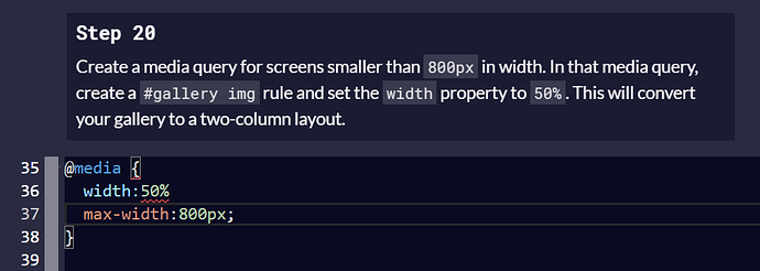
The max-width property is an attribute(?) of the @media rule, so it needs to be enclosed within parentheses immediately after “@media”. From there, the media query is treated sort of like a wrapper that goes around your normal CSS. Use the curly brackets to enclose the CSS, then write it like normal. Don’t worry, you’ll have curly brackets within curly brackets and it will look kind of weird at first (or it did for me when I first tried it. Lol).
Here’s a link to the w3 Schools page, which will probably explain it way better than I could:
If you are still having trouble, let me know. Good luck!
Thanks, i was on MDN and then went there and found it, and yes looked TOTALLY weird! Thanks for the assist!!
No prob. Have a great day! 
Hi there!
This is the code that worked well for me!
Hope I could help!
@media(max-width:800px){#gallery img {width:50%}}
Br
